
Today we’re going to take a look at Rosehill Preserve. This is an apartment here in Orlando, Florida. And we’re just going to take a look at some apartment marketing ideas, review the website, what I like, what I don’t like about the website and some recommendations to fix these issues.
This apartment looks to be marketing towards the millennial crowd, so we should think about how apartment communities can market their product to a younger generation.
The three central concepts that we’re going to take a look at today are tailoring content to your audience, making it easy to take action and then also placing several call-to-action elements or CTA’s on each page to drive traffic to specific locations in the site. As you look through these tactics you should think about different approaches to market your apartment community.
So, from the beginning, what we could do is we just take a look at the logo, and I love all of the minimalist design that they have going on on the site.
Contact Information In The Top Right Of This Apartment Website
One thing I noticed with apartments is in the top right, where about 99% of apartments that I’ve worked with, you’ll notice that there’s an ‘Apply,’ a ‘Residence Portal’ and then a ‘Phone Number.’
We can see up here that the three elements almost blend together.
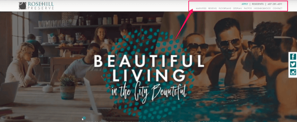
I know that ‘Apply’ is outlined in the different column which is great. But the purpose of the site is to get new people in the door to sign leases; not necessarily to get current residents to pay their bills. There are other ways to accomplish this, and we will take a look through the other options in the future.
For a quick and easy fix to this issue, I recommend is removing that residence link, putting it somewhere else and making this about signing new leases. Since your website is meant to lead your apartment marketing efforts, you should optimize all components of it to drive conversions. That includes getting that phone number more significant, as well as the ‘Apply’ button, stand out a little bit more.
Looking At The Rose Hill Preserve Apartment Website Structure
We can tell that this is a one-page website design because we could click on these various elements and we see that it scrolls us down the page. So, again we’re going to come up to the top with that in mind and scroll down a little bit.
The first thing I see is a very nice ‘About Us’ section. I think that it’s nice that it has the kind of rooms that they offer, the premium features, the luxury editions and also that it’s in Orlando to Florida.
One thing I’d recommend in this area is to drop this part right here down one paragraph. And the reason I mention that is because it does look a little bit compressed and on average, I usually do it to keep my sections about two to four sentences in each paragraph.
When writing content for an apartment website, we need to focus on readability. Breaking up text in this way will also help our message stand out on mobile, and those kind of items are very important when it comes to usability and accessibility. The most important part of an apartment marketing website is to ensure your customers can access and consume your content easily!
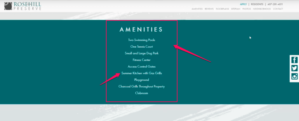
As we continue to scroll down, we see the bread and butter of any apartment website; the amenities.
The amenities are what are the value propositions that you bring to the table for people who are looking for a new apartment? And two swimming pools? Wow, that sounds good; One tennis court, great!
I love to play tennis; your dog park, fitness center, controlled gates; that’s all good, but the current layout and descriptions did really give readers many contexts about the value and benefits of these amenities.
I don’t know what size swimming pools are; I don’t know when they’re open, I don’t see how they look. I also don’t know how well kept the tennis court is. Whats large and a small dog park? Is that for the dog or is it the actual size; the landmass for those parks?
Align On-Page Content With The Value Proposition Of The Apartment
The other thing is that Rose Hill Preserve describes itself as a luxury apartment. However, their current content is missing out on this site an opportunity to improve the SEO.
To fix this, the apartment community can add a link to their content that would expand out to more information about each amenity. The best way to ensure the success of your apartment marketing strategy is to make all of your content emphasize the value and lifestyle that you offer your ideal customers.
People aren’t buying the apartment or renting the apartment for the apartment, they’re renting that for the ease of use, for the lifestyle and for the other perks that come around; other than going to another apartment or buying a house or something like that.
Looking back at the playground amenity. Is just a pit of dirt with a swing or how large is it? Is it well-kept? So, I think that that has a lot of opportunities there for SEO optimization where you could integrate a lot of keywords and then on top of that, you could also show people using it and help your potential new residents to envision themselves in that area.
Include Several CTAs On Each Page Of Your Apartment Website
One thing I noticed is that there are not many Call-To-Actions on many of the apartment website pages, which is one of the concepts that we want to take a look at.
As we scroll down, I usually like to keep call-to-actions every 2 to 3 sections. So, this is a section the ‘Slideshow’; this is a section the ‘About Us,’ this is the section the ‘Amenities.’
I recommend that this apartment complex include some call-to-action across all pages on their apartment website. And the easiest way to do that is to make a full-width band with a different color that stands out and then have a white button in there that says, ‘Are you ready to apply?’, ‘Apply Now’ or ‘Check out Floor Plans” or something like that.
This type of design and messaging helps to progress the audience through the customer journey. And that’s something that’s missing here that stands out as the inability to take action as I need it.
Include Review Sections Of Your Apartment Website Design
Review sections are significant for anything from e-commerce but especially for apartments because you’re signing out your long lease for $1,500 a month which comes up to be the right amount of money. And this review section is worthless in my opinion, and the review section is one of the most important pieces of an apartment marketing website.
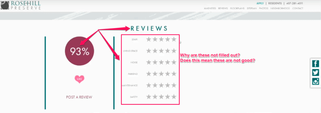
It’s great that they have a review section. However, I don’t know what the stars mean. Are these stars empty? I tried, to click them because I’ve come to think that stars should be gold if they’re filled out.
I like to keep review sections with three testimonials. I can almost envision it; just three columns with either rotating or static, with the current residents’ face; so you could start to do a connection and then a two to three sentence with some stylized, that would go a long way. And then also a call-to-action right below.
What that’s going to do is improve the social proof and then also make it a little bit easier to trust the apartment and to make your choice.
Ensure The User Experience Is Great On Your Entire Site
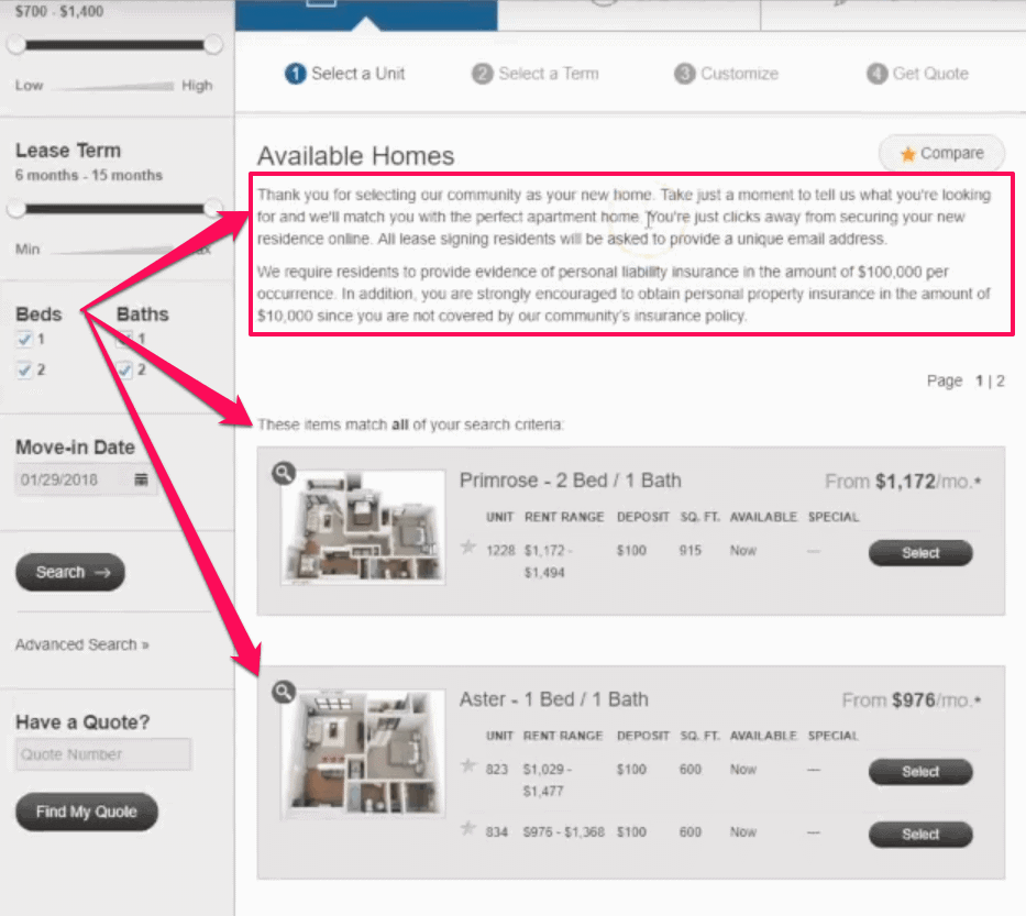
And this one is a little bit more advanced, but I did want to point it out. This has to do a floor plan. And this is, you know, the core of what we’re doing here is that we’re trying to get people to sign a lease for their needs.
So, I’m going to go and click on 104 Daisy Floor Plans. Okay, I need a two bedroom, one bath.
It’s great that these floor plans are in 3D because I could envision myself here and see what the layout will look like. And this is useful information but download? What do I need to download? At the same time, the download doesn’t even work.
And then if we go down here; availability, remember I clicked on Daisy, so that means I need a two bedroom, one bath. This opens up to a new page; disruptive. I don’t know if I trust this; is this legit? I don’t know.
But as I go down, this is a lot of information that I don’t necessarily need because I was only interested in the Daisy floor plan. But as we look here, there’s nothing here on Daisy. So, either Daisy is not available, or they’re just not selling anymore.
Either way, this disrupts the user journey. At this point, I trusted the site enough and I wanted the product, that I clicked on it over; looks like the Daisy Floor Plan is not available.
A Quick Fix To A UX Problem On Your Apartment Marketing Website
And one way that the site could prevent this from happening is just to include some notification down here that works with their database or whatever it might be, that just says, “This is not available right now.”
This messaging is going to prevent me from committing and getting excited like, “Oh, I finally found a two bedroom, one bath; 915 square feet”. But when I go and try to sign a lease or take the next steps, I find out that it’s not there; that could get frustrating.
This is why emotional SEO copywriting for apartments is vital- not only does this type of content engage your customers, it also helps you get found online!
Another call-to-action here would be great if that were included. I don’t know what this is. I clicked on this, and it’s doing anything.
So, that’s kind of wasted space that this doesn’t do much of anything like the leasing offices. It’s pretty easy to find out, in my opinion, a big picture of it.
How To Leverage A Photo Gallery For Your Apartment Marketing Website
Photos are essential for your apartment marketing website because they allow your prospects to see what they are entering into with your apartment community.
Not only are image galleries great to look at, but they also build that trust, help people envision that they’re going to be there.
I’d recommend putting the photo section maybe a little bit higher up and then integrating photos like these photos throughout the site. So, instead of just having a photo section, you can have like a three-quarter, one-quarter layout, in sure ribbons or individual rows and the photos would be in that one quarter.
And then the neighborhoods section is a pretty cool idea, but I think it’s vanity and doesn’t add much value to the site or Customer Experience. I was just clicking on these; it doesn’t help me, and it seems to slow down the load speed.
I recommend taking this out, and you could fill this out more and like your, maybe a blog or something like that, and do some partnerships or things like that.
Optimize Your Contact Us Page To Drive Qualified Leads To Your Apartment
And then finally, ‘Contact Us’ page. At this point, if somebody scrolls down this far, they should be ready to purchase with you. If you want to get them to email you, I will take all of this stuff; maybe just first and last name and email.
I don’t think you need a phone number. I mean, if you want it, you could; that’s up to you. It’s essential just to get the information up front and then work from there. And social scene; there’s nothing even here. So, I don’t know if a social view is necessary.
Leverage These Tips For Your Apartment Marketing Website!
So, there we have it. We just looked through the Rosehill Preserve; which is an apartment building here in Orlando, Florida.
We will continue looking at apartment websites to find ways to improve them as ongoing series; looking at different ways to enhance apartment building websites. And we can use these concepts to, not only approve apartment websites but also apply that to e-commerce and any other kind of websites for your needs.
So, thanks for watching how this work. We will be putting some links in the description for an additional resource in case you need them, and we look forward to taking a look at other websites with you in the future.
About the Author: Ayasha Giarratana

In This Article...
- Contact Information In The Top Right Of This Apartment Website
- Looking At The Rose Hill Preserve Apartment Website Structure
- Align On-Page Content With The Value Proposition Of The Apartment
- Include Several CTAs On Each Page Of Your Apartment Website
- Include Review Sections Of Your Apartment Website Design
- Ensure The User Experience Is Great On Your Entire Site
- A Quick Fix To A UX Problem On Your Apartment Marketing Website
- How To Leverage A Photo Gallery For Your Apartment Marketing Website
- Optimize Your Contact Us Page To Drive Qualified Leads To Your Apartment
- Leverage These Tips For Your Apartment Marketing Website!